Spiked Gothic display font for high-impact headlines
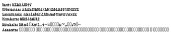
KZ Gravity applies a spiked Gothic display style to headline and logo text, using sharply cut letterforms and blade-like notches to create aggressive visual impact. Designed by Kazuyoshi Ishikawa and released under the KZ Gravity name, the font ships as a TrueType file for Windows and macOS. It offers an irregular, angular silhouette and dramatic stroke contrasts for designers working on sci-fi, horror, or heavy-metal branding and title graphics.
What it changes about headline presence
KZ Gravity turns ordinary display copy into a carved, industrial statement. The face’s hooked edges and spiked terminals create a restless silhouette, so short text such as titles, logos, and posters gains high visual tension. The design emphasizes impact rather than long-form legibility, which matches the font’s intended use in gaming graphics, album covers, and event merchandise.
How much control designers get over typographic detail
The font exposes a limited, focused glyph set that constrains extended typographic work. KZ Gravity includes roughly 89 glyphs covering Basic Latin plus digits, so designers can rely on standard uppercase, lowercase, numerals, and punctuation for display layouts. The dramatic variation in stroke width and irregular outlines offer visual variety, but the set lacks extended accents and special symbols for international typesetting.
How to install and how it behaves on desktop systems
Installation follows standard TrueType workflows, and the file integrates with system font menus. Distributed primarily as a .ttf, you extract the font from a ZIP, right-click the .ttf and select Install to add it to the desktop font library. Desktop programs that accept TrueType fonts can use it immediately; the format ensures compatibility across Windows, macOS, and Linux font-aware applications.
What to expect for compatibility and practical limits
The tool works across common desktop platforms but is not suited to extended multilingual layouts. TrueType compatibility means the file loads in most modern design apps, yet the Basic Latin coverage restricts use where accented characters or specialist glyphs are required. The design’s aggressive forms suit short, display-only use rather than body text or interfaces that need high readability at small sizes.
A focused display choice for headline-driven, genre work
KZ Gravity is a niche display option for designers and creators who want an aggressive, carved typographic look for short, attention-grabbing copy. Its limited glyph set and lean character coverage make it inappropriate for multilingual or body-text work. For projects that demand a stark, techno-horror or heavy-metal aesthetic, the font supplies a clear, ready-to-use visual voice without extra ornamentation.